Certainties and Uncertainties
Revisiting and extending Sarofim et al. 2024. Also, I talk about RCP8.5

IMPORTANT NOTE: I am updating both the FaIR and BRICK code to address some issues highlighted by Zeke Hausfather and Tony Wong. I hope to post a new version of this substack by Monday. The main conclusions should be robust, but many details (in particularly, the observation/model comparisons) are likely to change. -MCS, 5/22/26
A couple of years ago I wrote (with the assistance of a half dozen coauthors) a paper quantifying future climate uncertainty based on unifying underlying datasets and models from other research groups. It is one of my favorite first-author papers.1 However, as I believe is true for most authors and most papers, the instant it was published I saw something I wanted to change in it.
Today I address that change, along with several other improvements.
Despite not having any coauthors and doing more complex analysis (inclusion of a sea level model and a pulse analysis), I was able to complete this task in a substantially shorter time frame than the original paper due to the assistance of Claude Code. I will be writing about some of the challenges I encountered while using Claude for this analysis in a future post (along with recommendations for how to instruct Claude to avoid potential errors).
One point I want to reiterate from the original paper: our best estimates of how much temperatures will rise by 2100 have reduced substantially since I was in grad school, due primarily to reductions in emissions projections due to improvements in renewable energy technologies. My paper is just one of many that came to this conclusion (see Figure 1 of Hausfather et al. 2025).2 See also this recent Climate Brink article. We still have work to do, but this is a cause for celebration.
One update since the original paper: I argued that it was important for the community to keep running climate models that reached higher temperatures because this was important for calibrating damage functions and understanding potential 22nd century temperatures. I stated that there were two ways to do this: 1) keep the RCP8.5 scenario alive, or 2) extend scenarios until 2150. Van Vuuren et al. (2026) state that “we request that the ESM models run all scenarios at least to 2150 AD”, and since the new high scenario (though lower than RCP8.5) should still reach temperatures above 4 degrees C by 2150, this accomplishes the recommendation set out in my paper.3
Amazingly, President Trump has weighed in on the removal of RCP8.5 described in the van Vuuren paper:
“GOOD RIDDANCE! After 15 years of Dumocrats promising that ‘Climate Change’ is going to destroy the Planet, the United Nations TOP Climate Committee just admitted that its own projections (RCP8.5) were WRONG! WRONG! WRONG!”
I… will just leave that there and move on (though the NY Times also covered this).
Finally, one consideration when talking about “uncertainty.” Scientists use the term uncertainty all the time, but sometimes people hear the word and think it means “we don’t know anything.” But 1) even with uncertainties, there are certainties: according to my analysis, the temperature in 2050 is 99% likely to be warmer than 1.55 °C above preindustrial (0.3 °C above the 2015–2024 average), so we are certain to see additional warming. And 2) uncertainty cuts both ways, and generally the uncertainty blade is sharper on the worse side. E.g., if you plan for an expected sea level rise of 30 cm, but it only rises 20 cm, you do lose some investment in unnecessary protections. However, if it rises 40 cm, there will be damages resulting from under protection. However, there is asymmetry: the excess damages from under protection are likely much larger than the excess costs for overprotection. Not only that, but generally for climate change uncertainty, the upper tails are much longer than the lower tails. Therefore, for adaptation purposes, it is best practice to plan for something rather worse than the median future expected temperature or sea level rise.
REVISITING SAROFIM
The key update that I wanted to do was to update the Hawkins-Sutton graph (Figure 4 in my original paper). This graph was baselined to preindustrial temperatures. Because of that, climate uncertainty contributed a substantial fraction of the uncertainty in the first year in my original Figure 4. The more standard approach to this kind of figure is to baseline to the first year of the graph, which leads to nearly 100% uncertainty contribution from internal variability in that first year. Moreover, the emissions uncertainty doesn’t start until 2020, and the more standard approach is also to start the plot in the same year as the emissions scenarios begin to diverge. Therefore, I wanted to update my figure to address those two issues.
However, as long as I was updating this figure, I also saw potential for some other improvements: producing a figure that compared to observations and adding a table showing the exceedance probabilities for different temperature thresholds.
Figure 1 here is the update to Figure 4 from Sarofim et al. In addition to baselining to the first year and making the first year the year in which emissions diverge, it also uses a more sophisticated ANOVA approach rather than the “change one variable at a time” approach we used in the original paper. Key results: internal variability accounts for more than half of the variability until about 14 years in the future, and emissions uncertainty overtakes climate parameter uncertainty as the primary contributor to uncertainty about 100 years into the future.
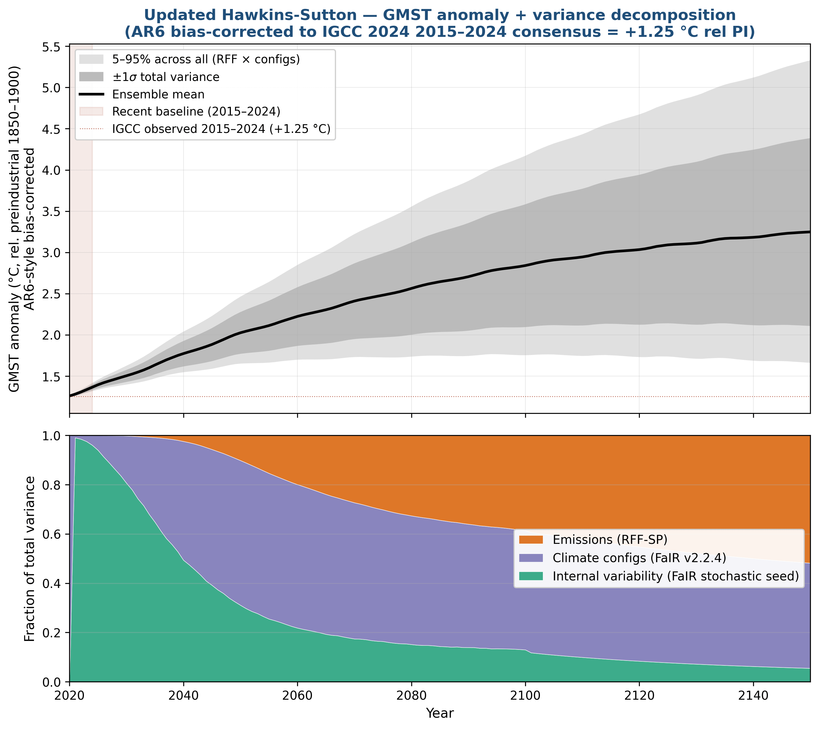
Figure 1: RFF-SP/FaIR temperature uncertainty, baselined to 2020. Top: median (line) and 5–95% range (shading) of the 398 × 841 ensemble. Bottom: fractional contribution of emissions, climate-response, and internal-variability uncertainty to total variance, year by year.
Figure 2 shows the modeled warming compared to observations.4 The modeled forcing includes volcanic eruptions, and the Pinatubo dip in 1992 is visible in both the model and the observations. Other wiggles in observations are due to ENSO variability, which the model is not expected to mimic – however, the internal variability from FaIR should (and does) encompass most of the observations. Uncertainty in FaIR increases as the time period becomes more distant from the calibration window of 2015–2024, as the different climate parameters lead to different historical temperature patterns. Discrepancies between the FaIR mean and the observations pre-1970 are due to two factors: first, observations are a single realization of reality, so not only ENSO wiggles but also larger scale internal variability can move temperatures off of the forced mean; second, global temperature estimates become more uncertain due to sparser coverage historically.
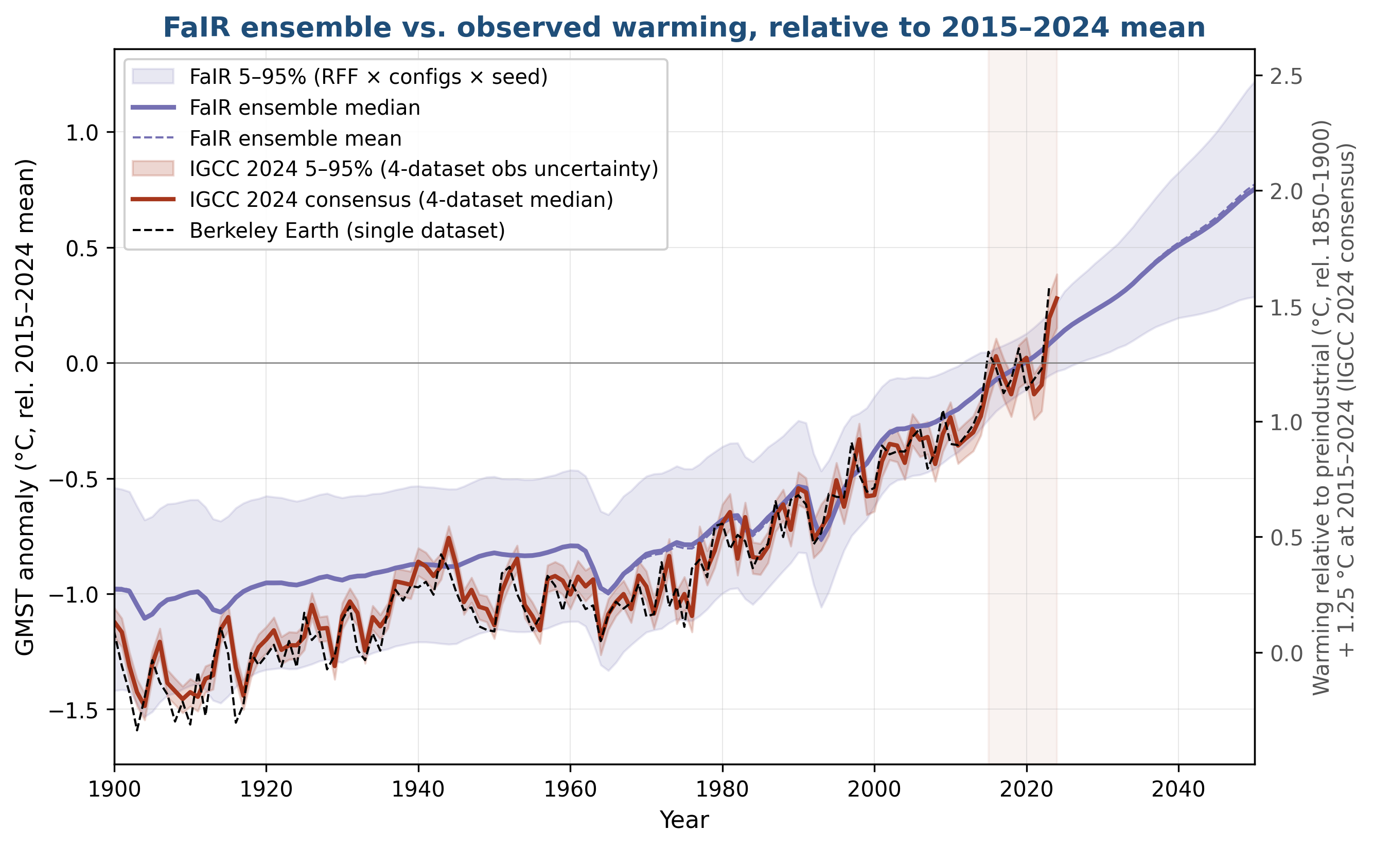
Figure 2: FaIR ensemble vs. observed GMST, all baselined to the 2015–2024 mean. Observations are the IGCC 2024 4-dataset consensus (HadCRUT5 + Berkeley Earth + GISTEMP + NOAAGlobalTemp).
Finally, Table 1 shows numerical temperature exceedance probabilities, which is useful for those who think in by-degree terms. Key exceedances include 1.5 °C (median exceedance in 2030, 95% of scenarios exceeding by 2036) and the 2 °C Paris goal (median exceedance by 2050). Also, relevant to the 8.5 question, by 2150 15% of scenarios are above the median SSP5-8.5 (the CMIP6 analogue of RCP8.5) warming of 4.4 °C at the end of the century, which is why it is important that the new high scenario from Van Vuuren et al. (2026) reaches similar temperatures by that time.
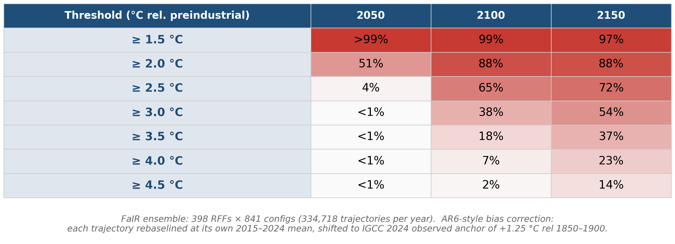
Table 1: Probability of GMST exceedance, RFF-FaIR ensemble.
EXTENDING SAROFIM
I am also presenting a poster at the AGU Chapman meeting on Sea Level Rise in June. For that poster, I extended the Sarofim et al. work to look at sea level rise. But I also decided that it would be interesting to look at the uncertainty not only of the baseline, but also of an added pulse of greenhouse gases. For the poster, because of limited space, I am only showing the impact of an added pulse of CO2, but here I will also show the impacts of an added pulse of CH4, because there is a lot of interest in comparing the two (the subject of a future post).
Figure 3 shows a Hawkins-Sutton decomposition for sea level rise.5 Note that internal variability only refers to climate variability from FaIR – as far as I am aware, BRICK does not have its own internal variability component, and I chose not to introduce a statistical variability. What is interesting here is that the BRICK uncertainty contributes at most 29% of the uncertainty (in 2046), and drops to 17% of the uncertainty by 2100. This is despite the key contribution of Antarctic Ice Sheet tipping points – apparently, the uncertainty in where the tipping point is (BRICK uncertainty) matters less than the uncertainty in what temperature is reached (FaIR + emissions uncertainty).
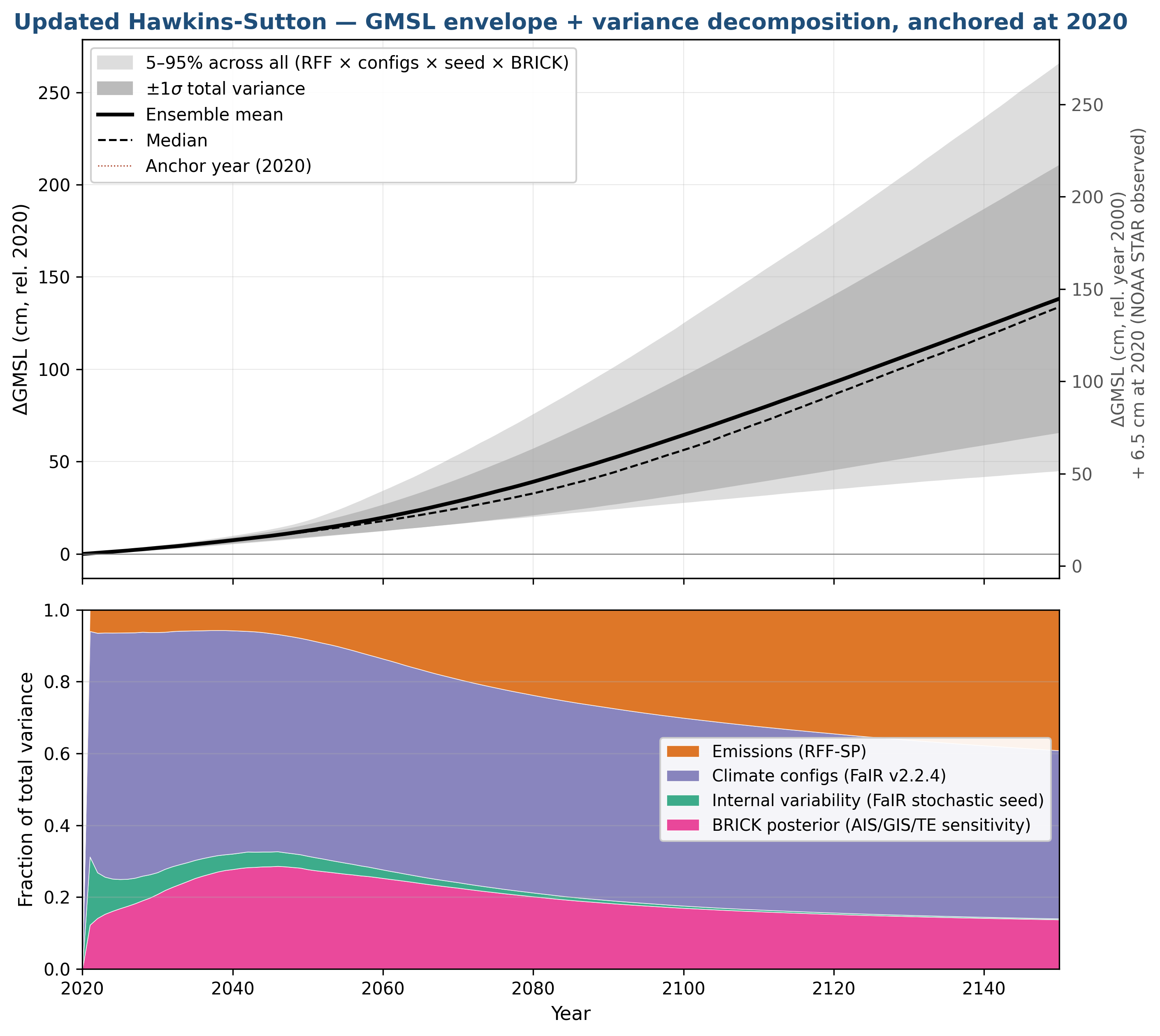
Figure 3: Hawkins-Sutton decomposition for sea level rise.
Figure 4 goes beyond baseline uncertainty and looks at the uncertainty in future impacts due to a pulse of CO2 or CH4 emissions. The near-constant temperature response to a pulse of CO2 emissions is no surprise – the effectively permanent contribution of 1 ton of CO2 to warming is the whole basis behind the cumulative carbon and net-zero CO2 movements (the seminal paper dates from 2009). Note that the scientific justification behind net-zero only applies to CO2: while reducing methane is important, because of methane’s short lifetime, it isn’t necessary to reduce methane emissions to zero in order to stabilize the climate. Unfortunately, there is a lot of confusion in environmental and policy circles about this distinction.
The other interesting aspect of these graphs is the comparison of the marginal SLR response to the two gases: methane emissions do cause a near-permanent increase in sea level, probably because the ice that melts due to the temporary warming does not refreeze when the warming goes away (plus inertia in thermal expansion). Also of interest is the equivalence between marginal CH4 and CO2 sea level rise about 100 years into the future – this is a consequence of having used the 100-year GWP in choosing the magnitude of the CH4 emission pulse. Since the heat added by the two pulses (i.e., the integrated radiative forcing, i.e., the GWP) is approximately the same over 100 years, the sea level rise over 100 years follows suit.
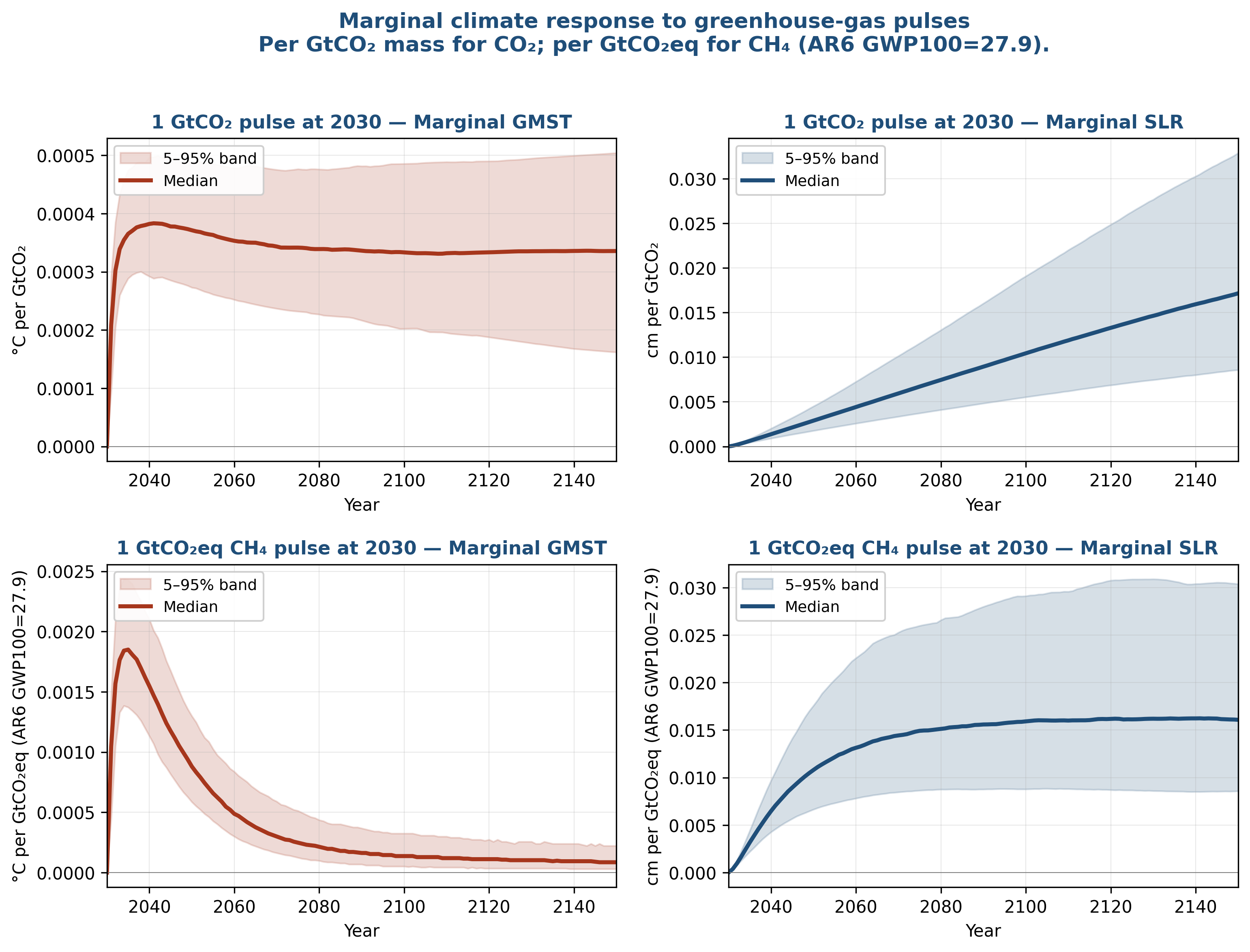
Figure 4: Marginal climate response per unit pulse emission at 2030, separated into CO2 (top row) and CH4 (bottom row). Left column: ΔGMST per pulse. Right column: ΔSLR per pulse.
Figure 5 shows the Hawkins-Sutton decomposition for pulses rather than the baseline. It shows that there is very little contribution of the emissions baseline to the impact of a pulse of emissions (at least as far as temperature change or sea level is concerned… that might not be as true for damages, where one might expect additional emissions in a warmer scenario would have more impact due to the non-linearity of damages with warming). Also interesting is that BRICK parameter uncertainty plays a larger role in sea level response. The tipping point dependence is a result of strong non-linearities in response in the Antarctic Ice Sheet, such that a marginal addition of emissions can sometimes generate a non-marginal response if the scenario is very close to exceeding that tipping point.6
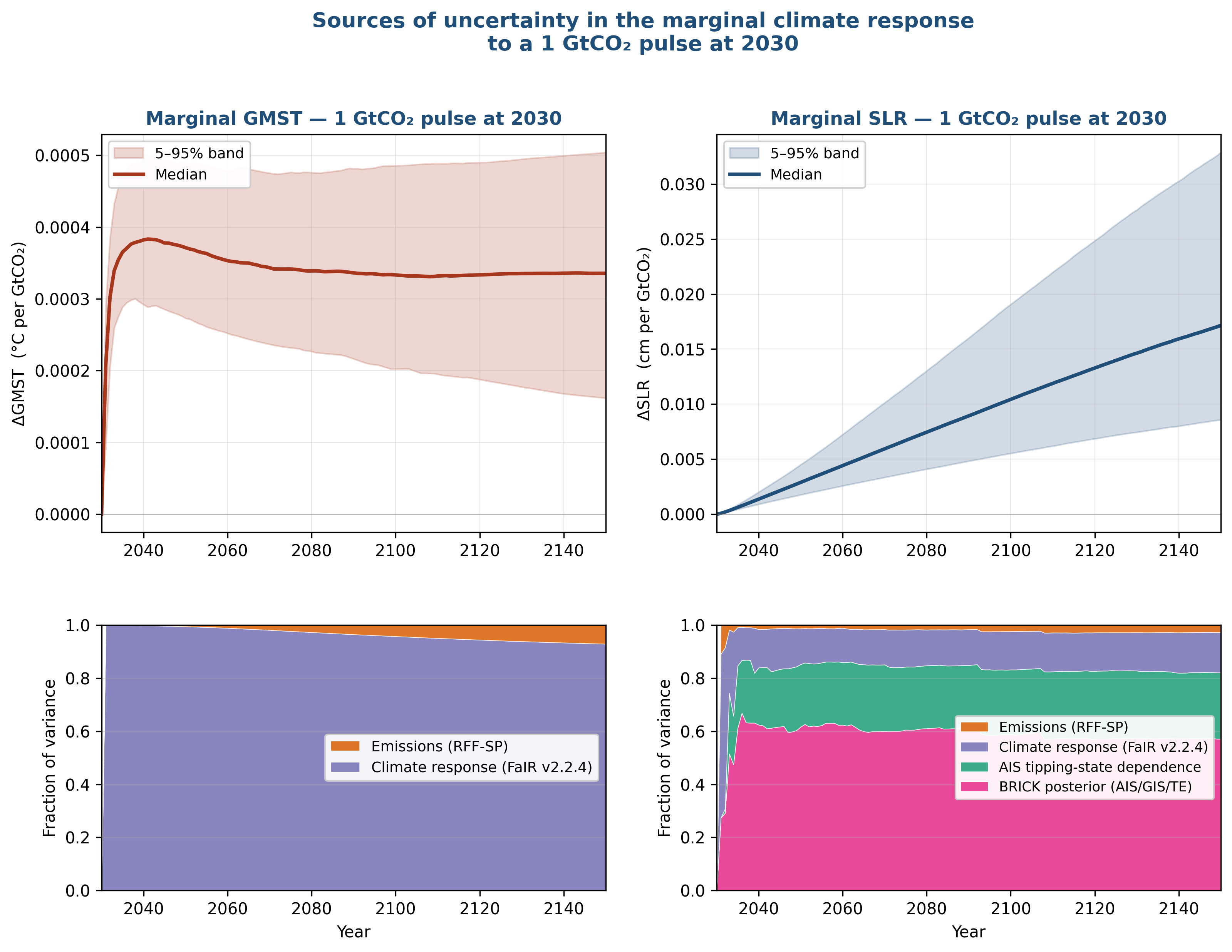
Figure 5: Hawkins-Sutton decomposition of pulse-marginal responses. Top: ΔGMST envelope and variance attribution for a +1 GtCO2 pulse at 2030. Bottom: ΔSLR envelope and 4-way decomposition.
Finally, for completeness, here is the comparison of the FaIR/BRICK modeling to a combination of Dangendorf’s 20th century reconstruction and recent satellite altimetry.7 The combination of FaIR and BRICK seems to substantially underestimate historical sea level rise, and a crude analysis suggests that a third of that could be due to FaIR warming less than observations over the 1900 to 1980 period (see Figure 2).
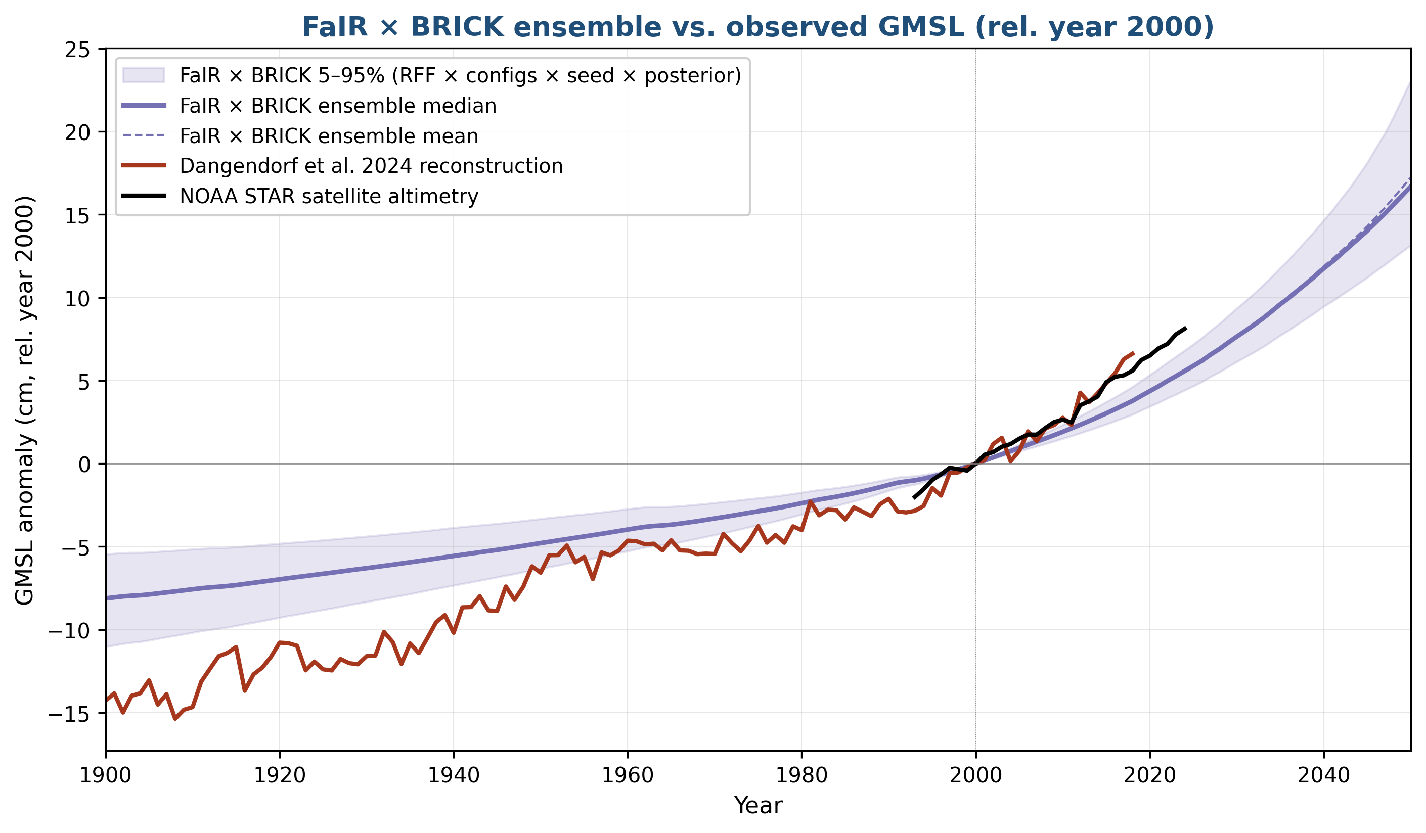
Figure 6: Modeled vs. observed GMSL. FaIR/BRICK ensemble (median + 5–95%) against Dangendorf et al. 2024 tide-gauge reconstruction (pre-1993) and NOAA STAR satellite altimetry (1993–2024).
CAVEATING SAROFIM
As with any academic publication there are many caveats, a number of which were discussed in the original paper. I highlight a few here:
This analysis is state-of-the-art in terms of uncertainty analysis. However, there are already known-unknowns, as well as the ever-present unknown-unknowns that make the uncertainty analysis incomplete. I think the median will be pretty close to the “true” value, but the tails will be underestimated for the physical responses (also, see next point for economics).
The RFF-SPs are now outdated. In the 4+ years since the RFF-SP expert elicitation was done, renewable and energy storage technologies have continued to improve faster than anticipated. Also, the closure of the Strait of Hormuz due to the ill-advised Iran war may actually stimulate a faster move away from oil as global oil markets have been shown to be very sensitive to world events in a way that the sun and wind are not. And even when the RFF-SPs were new, it is very very difficult to make estimates of how emissions might evolve over the span of a century or more (but just because such projections should be taken with large grains of salt, it is still important to do them).
Figure 6 shows that BRICK and observations don’t quite match. I hope that I might be able to learn more about this apparent discrepancy at the AGU Chapman SLR conference.
In order to do an ANOVA, we used only 398 RFF-SP scenarios and paired each one with the full 841 FaIR runs. If not for the ANOVA requirement, I would have used a Latin-Hypercube Sample approach, using more RFF-SPs but not the full FaIR set for each one. This means this analysis drew from a smaller subset of the emissions uncertainty than I would have preferred.
I will also note that there were two blog critiques of my 2024 paper. I originally wrote a long screed attacking the blogposts, but deleted it as not being worth my reader’s time.
NEXT STEPS
There are two known-unknowns in FaIR that I think I can credibly estimate using somewhat ad hoc methodologies. The first is the lack of permafrost feedback. Here, a great paper by Dawn Woodard set out equations that can be used to implement permafrost feedbacks in reduced complexity models, and I think I can do that as a post-processing step with FaIR. Second is that ozone is known to impact ecosystem uptake (see my 2005 paper!) and that relationship is not explicitly included in FaIR. I think that I can add another post-processing approach to add that relationship specifically for the ozone produced by methane decay, relying primarily on a paper by Nadine Unger.8 Redoing an uncertainty analysis with those two known-unknowns addressed will be an interesting test of how much the uncertainty distribution shifts just by addressing a couple of known limitations.
The other potential next step is to write this up as a manuscript for submission to a journal. The challenge is that it might be considered a modest extension to a previous paper, and the use of the RFF-SPs might be considered outdated (though there is still no good alternative fit to the purpose to the best of my knowledge).
To sum up: there are uncertainties but there are also certainties, RCP8.5 is dead but we still might reach RCP8.5 temperatures by 2150, and the worst-case scenarios now seem less likely but also avoiding a 2 degree future seems unlikely. And good analysis continues to be worth doing.
SAROFIM METHODS
For readers who care about how the sausage is made, I’ve had Claude write up the methods, with some light editing from me (the opposite to how the rest of the post is written, where I write the post with light editing from Claude):
Emissions. 398 socio-economic / emissions trajectories drawn randomly from the RFF-SP set (Rennert et al. 2022), the same probabilistic ensemble that underlies EPA’s recent SC-GHG analyses.9
Climate. Each emissions trajectory is run through FaIR v2.2.4 using all 841 of the FaIR team’s calibrated posterior parameter configurations (climate sensitivity, ocean heat uptake, aerosol forcing, carbon-cycle feedbacks), fit to historical observations and AR6 assessed ranges.
Sea level. Each GMST trajectory is then fed through MimiBRICK, which has separate components for thermal expansion, glaciers, and the Greenland and Antarctic ice sheets. BRICK’s posterior is re-weighted using an AR(1) importance weight that disfavors draws whose predicted historical GMSL trajectory fits observed GMSL poorly, based on Wong et al. 2026.10
Baseline offset. I apply the standard AR6 framing: each FaIR trajectory is rebaselined to its own 2015–2024 mean and then shifted up to the IGCC 4-dataset observed anchor of +1.25 °C rel. preindustrial. Every trajectory passes through observed present-day warming, and the future spread is added on top.11
Variance decomposition. All “where does the spread come from” attributions use the Hawkins-Sutton (2009) framework, decomposing total projection variance at each year into emissions, climate-response, internal-variability, and (for SLR) BRICK-posterior components. I use an ANOVA-based variance estimator rather than the change-one-variable-at-a-time approach used in the original Sarofim et al. paper.
Pulse experiments. Marginal responses are computed as paired baseline + pulse FaIR/BRICK runs at 2030. For temperature, the response is linear in pulse size; I use a +1 GtC pulse and report results per GtCO2. For sea level, AIS tipping introduces a nonlinearity at large pulses — about 5% of BRICK posterior draws have ice-sheet states close enough to threshold that a 1 GtCO2 pulse can push them over. So I report medians (pulse-size invariant; immune to the tipping tail) rather than means (which are tipping-dominated), and I run a +0.01 GtC companion experiment to confirm the small-pulse linear limit. The variance decomposition is necessarily done at the +1 GtC scale, where the tipping-state-dependent variance is actually present.
A github link is under development, and will be posted in the comments when ready.
Along with my 2018 GWP paper, my 2021 temperature binning paper, and my 2015 methane-ozone mortality paper. I feel like all four papers will stand the test of time as good papers – though I do acknowledge that the methane-ozone paper has already been superseded by the superior McDuffie et al. 2023 version.
I would contend that my paper did the best job of combining emissions and climate uncertainty for the reference scenario, along with Rogelj et al. 2023. While Rogelj was more optimistic than the RFF-SPs (possibly due to a few more years of data about the renewables revolution), they had similarly wide uncertainty bands for future emissions as is appropriate. One of my favorite examples of incorrect overconfidence comes from a 1995 Granger Morgan and David Keith expert elicitation on climate sensitivity. See expert #5, almost certainly Richard Lindzen, who not only had the lowest climate sensitivity estimate but was extremely certain about his estimate. Reader: he was 100% wrong. And this is reflective of the general approach of climate contrarians: they are so devoted to the idea that GHG emissions must be harmless that their scientific judgment suffers badly.
FaIR was calibrated against IGCC. For recent temperatures, I like the methodology used by Berkeley Earth best. However, I have a soft spot for GISTEMP: back in 2010, EPA received petitions for reconsideration on the Endangerment Finding which included several criticisms of the observational datasets. One criticism was about “station dropout” where petitioners claimed that because there were fewer cold latitude stations reporting data after 1992, the data was being skewed warmer. This betrayed a total misunderstanding of how global temperature datasets and anomalies work. But in any case, I was able to use an open source GISTEMP emulator, Clear Climate Code, in order to show that a global temperature dataset based only on stations reporting data after 1992 looked nearly identical to a dataset based only on temperatures from stations that stopped reporting data after 1992 (see Response 1-62). One of the frustrating things about contrarians is that many of the most vocal have no real understanding of how climate science is done, and they avoid basic tests of their criticisms that only require simple code experiments.
I treated BRICK parameter uncertainty as conditionally dependent on the FaIR output via importance weighting — see Methods.
Figuring out how to handle this was actually challenging: I was getting very odd looking graphs where the mean would jump every time the pulse was enough for one additional scenario to tip over. It turns out that Lemoine and Traeger developed a methodology that can handle this kind of problem.
In my opinion, Dangendorf, Hay, and Kopp have produced the best global sea level rise reconstructions. As far as satellite altimetry estimates go, I just pulled down the one that was the easiest to get.
The methane/ozone impact will have minor effects on the baseline climate projections because of offsets that will happen in the post-processing step, but there will likely be more substantial changes to the methane pulse impacts.
398 rather than 10,000 because each RFF-SP is paired with 841 FaIR configurations, and at some point you have to stop running things.
Without this weighting, posterior draws with implausibly aggressive ice-sheet tipping would carry the same weight as draws that actually reproduce 20th-century observations. The weighting tightens the posterior substantially, which is one reason BRICK’s variance contribution drops off so quickly in Figure 3.
FaIR’s ensemble median for 2015–2024 when starting from the 1850-1900 baseline is about 0.21 °C cooler than IGCC observes. The baseline offset places the trajectories at the right level today, but the path from 1900 to today remains gentler in FaIR than in reality — see Figure 6.
For anyone wanting to look under the hood, github is now up and functional:
Code and methods: https://github.com/msarofim/SLR-RFF-BRICK Intermediate data: https://doi.org/10.5281/zenodo.20312325
Addendum number 3: Gavin Schmidt has also written a great post on this topic: https://www.realclimate.org/index.php/archives/2026/05/scenarios-schmenarios/