Simulations Revisited
This is what doing science looks like

When I was but a young graduate student and frustrated that a computational error meant that I had to restart a whole bunch of simulations, a wise post-doc took me aside and said, “Yes. Trying and retrying is what science is all about. If re-search was easy, then it would just be called search.”
So in that vein, I made several improvements to my previous analysis: using a better historical emissions inventory, a more updated FaIR calibration file, and a more updated BRICK calibration file (thanks to Tony Wong and Zeke Hausfather for their input). I’m also using a Latin Hypercube for the main analysis that uses the full 10,000 member RFF-SP ensemble. I also switched from an ANOVA decomposition for the Hawkins-Sutton plots to a Sobol methodology.1
Great model/observation agreement
First, the updated model/observation comparisons are much better:2
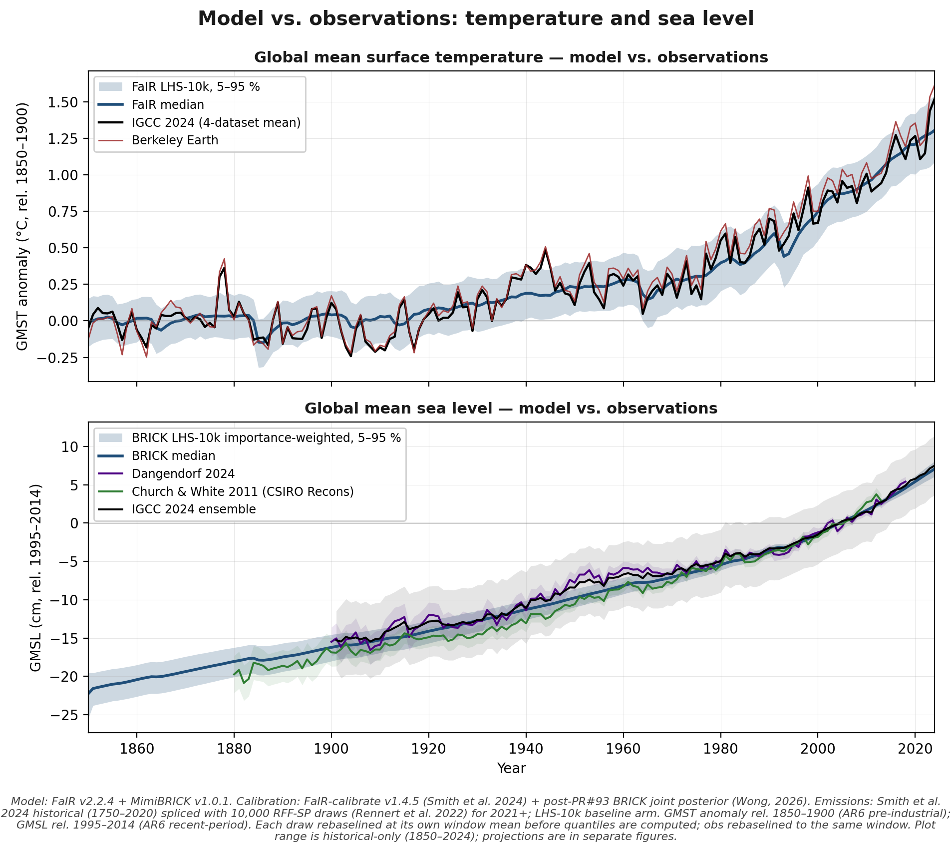
Figure 1: Model/observation comparison for global temperature and sea level.
Claude-isms
Before I move to the rest of the plots, here are two more Claude confusions (though Claude continues to be invaluable for my analysis work):
After doing some data analysis, Claude stated that “Berkeley Earth runs ~0.25 °C hotter than IGCC at 2024 — a known Berkeley-vs-other-product difference, not a FaIR problem” EXCEPT, after being pushed on that assertion: “Major bug found. The csv file’s total_p50 is the decomposed anthropogenic-warming trend (smoothed), not the observed annual anomaly.” So Claude tried to claim, not for the first time, that a discrepancy that was the result of its own bug was a “known” issue out in the real world.
Later, Claude generated an implausible-looking Hawkins-Sutton plot for sea level rise. When I pointed out a key error, Claude supported its point with a secondary data analysis… which had its own flaw. When I finally wrestled it into submission, Claude admitted, “you’ve twice gotten burned by my SLR-related claims today, so checking before acting.”
The other updated outputs
The median, 95% years, and 8.5 exceedance probability were all updated by modest amounts in the following paragraph:
“Key exceedances include 1.5 °C (median exceedance in 2031, 95% of scenarios exceeding by 2040) and the 2 °C Paris goal (median exceedance by 2049). Also, relevant to the 8.5 question, by 2150 20% of scenarios are above the median SSP5-8.5 (the CMIP6 analogue of RCP8.5) warming of 4.4 °C at the end of the century.”
Figure 2 and Table 1 are modest updates relative to the prior post. The Hawkins-Sutton plot now has an explicit “interaction” factor.
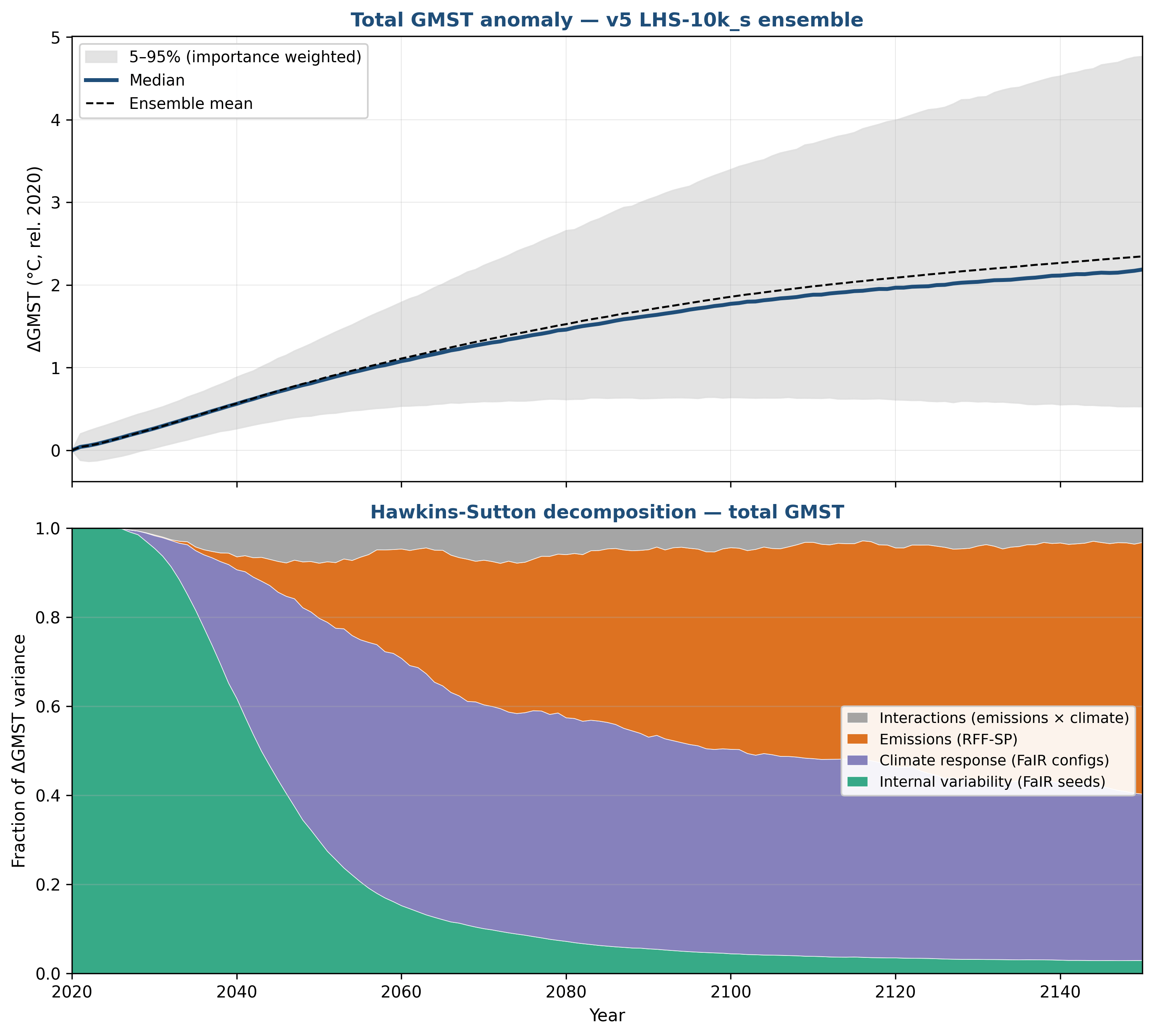
Figure 2: Top Panel: Future temperatures based on RFF-SP emissions and the FaIR climate model using a 10,000 member Latin Hypercube Ensemble. Median (line) and 5–95% range (shading) of the ensemble, baselined to 2020. Bottom: fractional contribution of emissions, climate-response, interactions, and internal-variability uncertainty to total variance, year by year, estimated using a Sobol methodology.
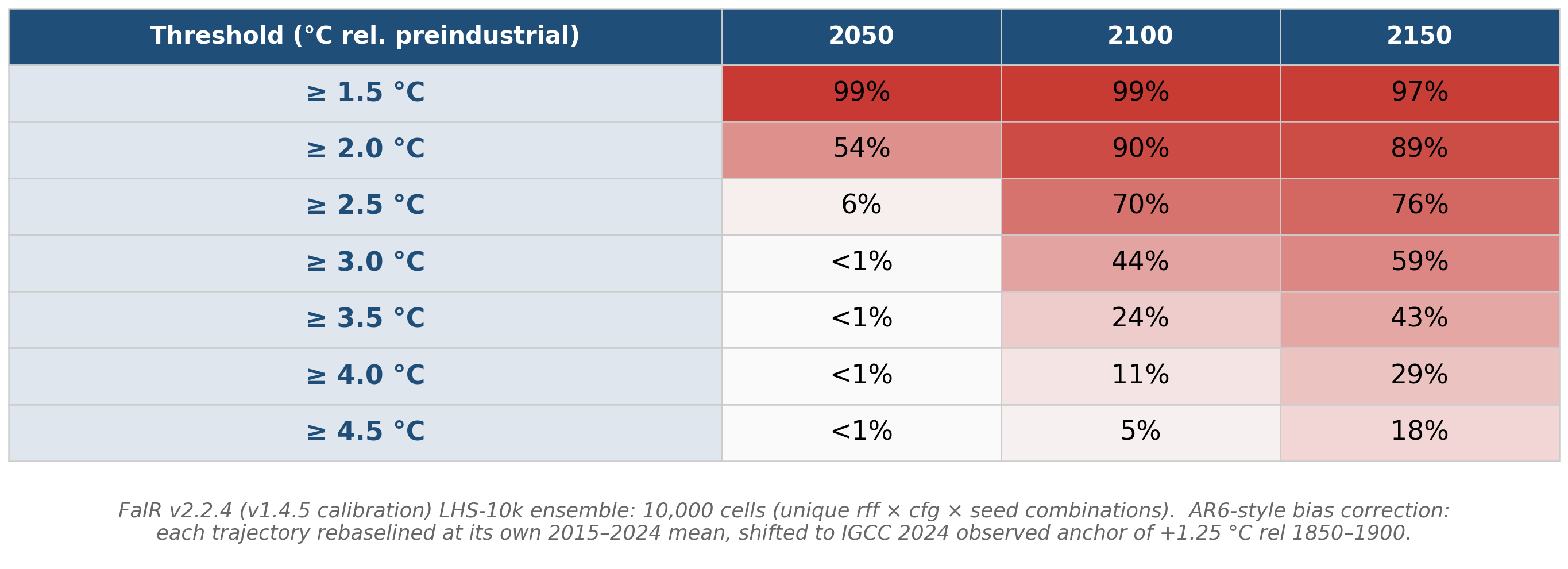
Table 1: Probability of exceedance of GMST thresholds based on the RFF-SP emission scenarios and the FaIR reduced complexity climate model.
For Figure 3, the 95% upper bound of sea level rise has decreased modestly. The Hawkins-Sutton figure has changed substantially with the new Sobol methodology: there is now an explicit Antarctic tipping point contribution, as well as a substantial interaction wedge. Figure 3b shows an updated ANOVA compared to the Sobol method to allow for direct comparison between the two. Because the ANOVA has a very limited number of emissions scenarios and BRICK parameter configurations, I think the Sobol method is more trustworthy overall, but I could probably be persuaded otherwise.
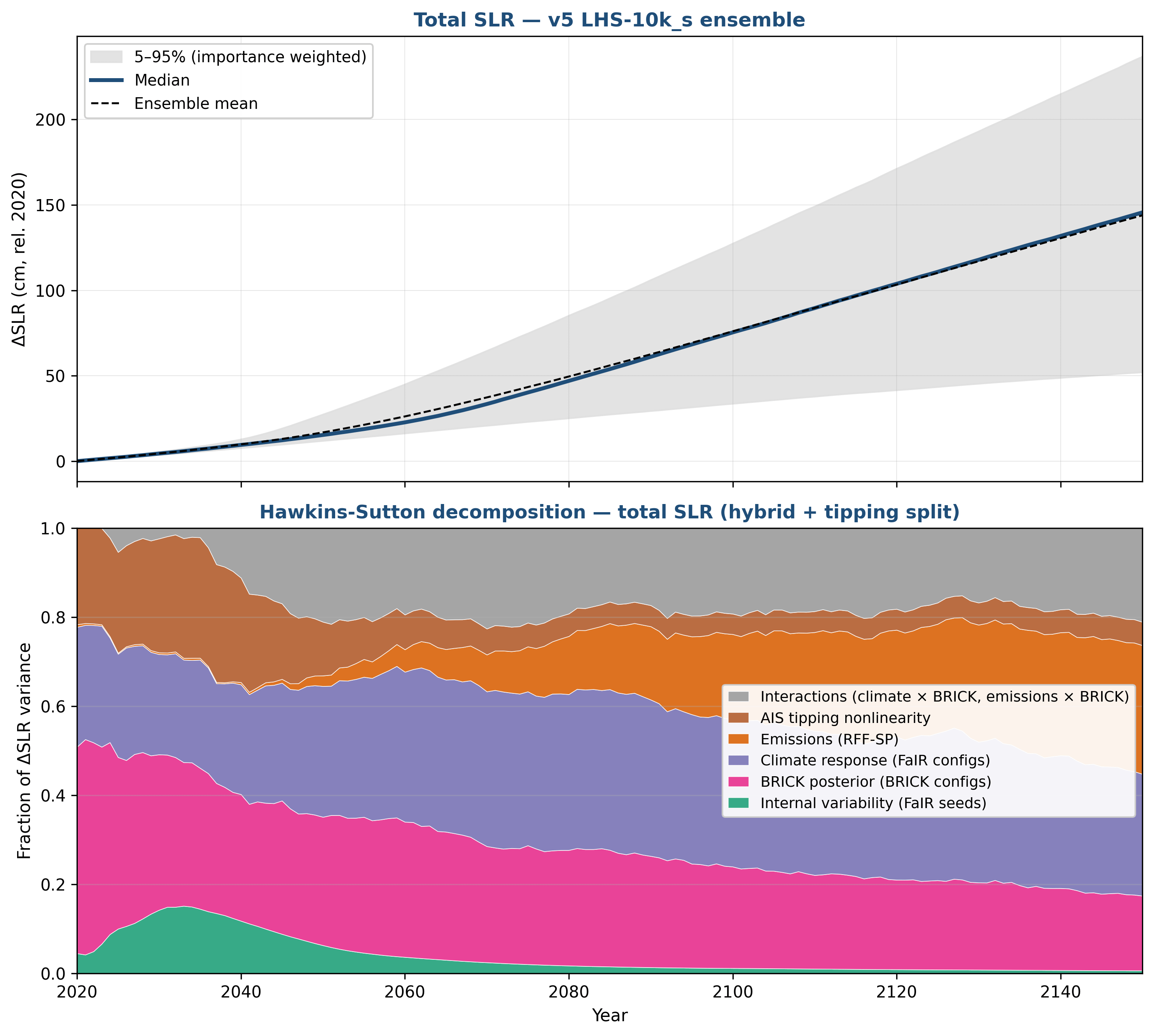
Figure 3: Top Panel: Sea level rise and 90% uncertainty bounds. Bottom panel: Hawkins-Sutton decomposition for sea level rise using the Sobol method for uncertainty in emissions (RFF-SPs), climate (FaIR configurations), sea level (BRICK configurations and non-linear Antarctic tipping points), internal variability (FaIR seeds), and interaction terms.
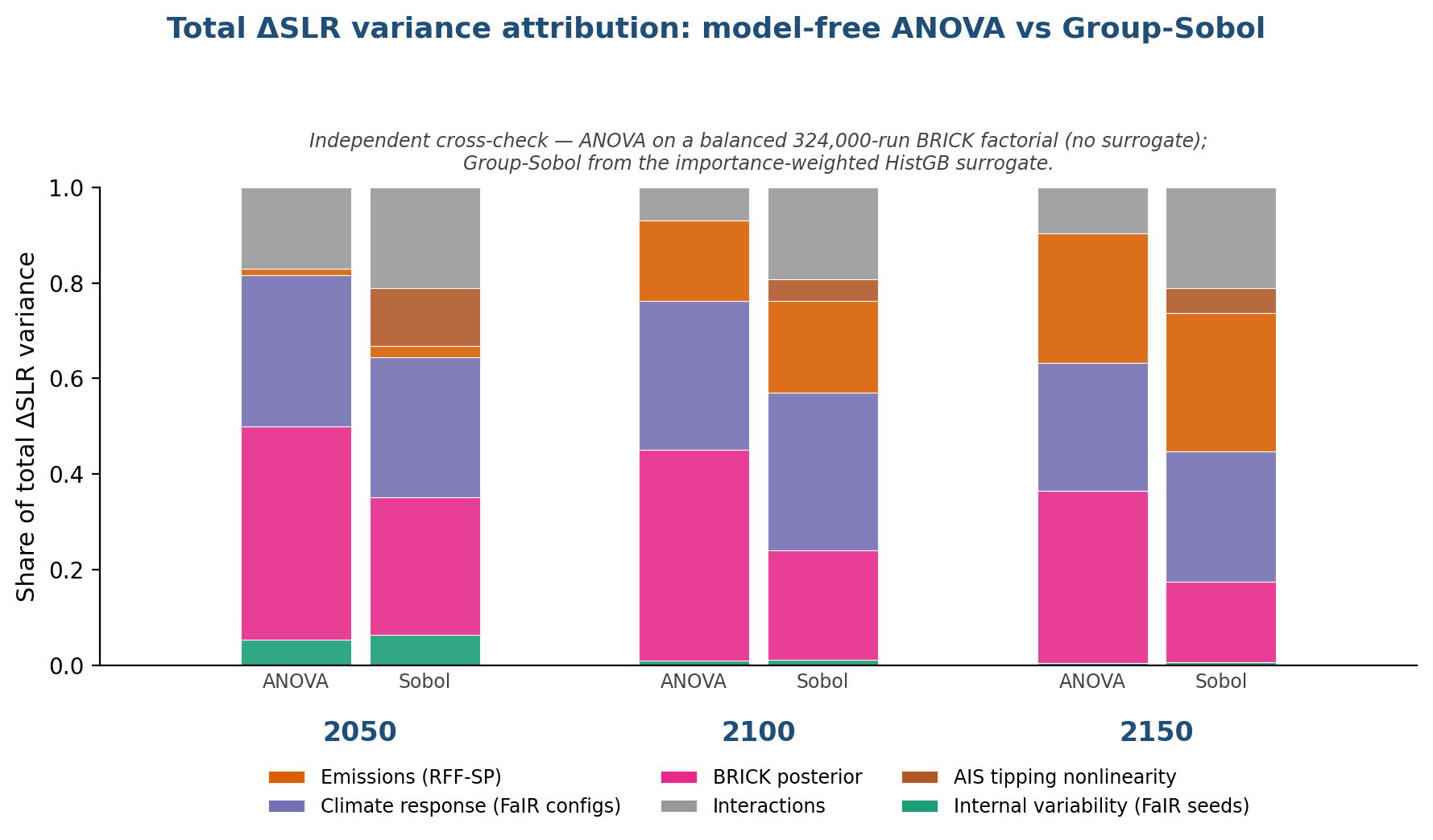
Figure 3b: ANOVA vs. Sobol comparison.
Figure 4 has the most policy-relevant change: the impact of a CO2 pulse on sea level rise has almost halved. Now, while BRICK’s baseline 21st century sea level rise projection in my updated analysis is somewhat higher than the AR6 best estimates, the response to a pulse is somewhat lower (at least in comparison to Grinsted et al. 2022).
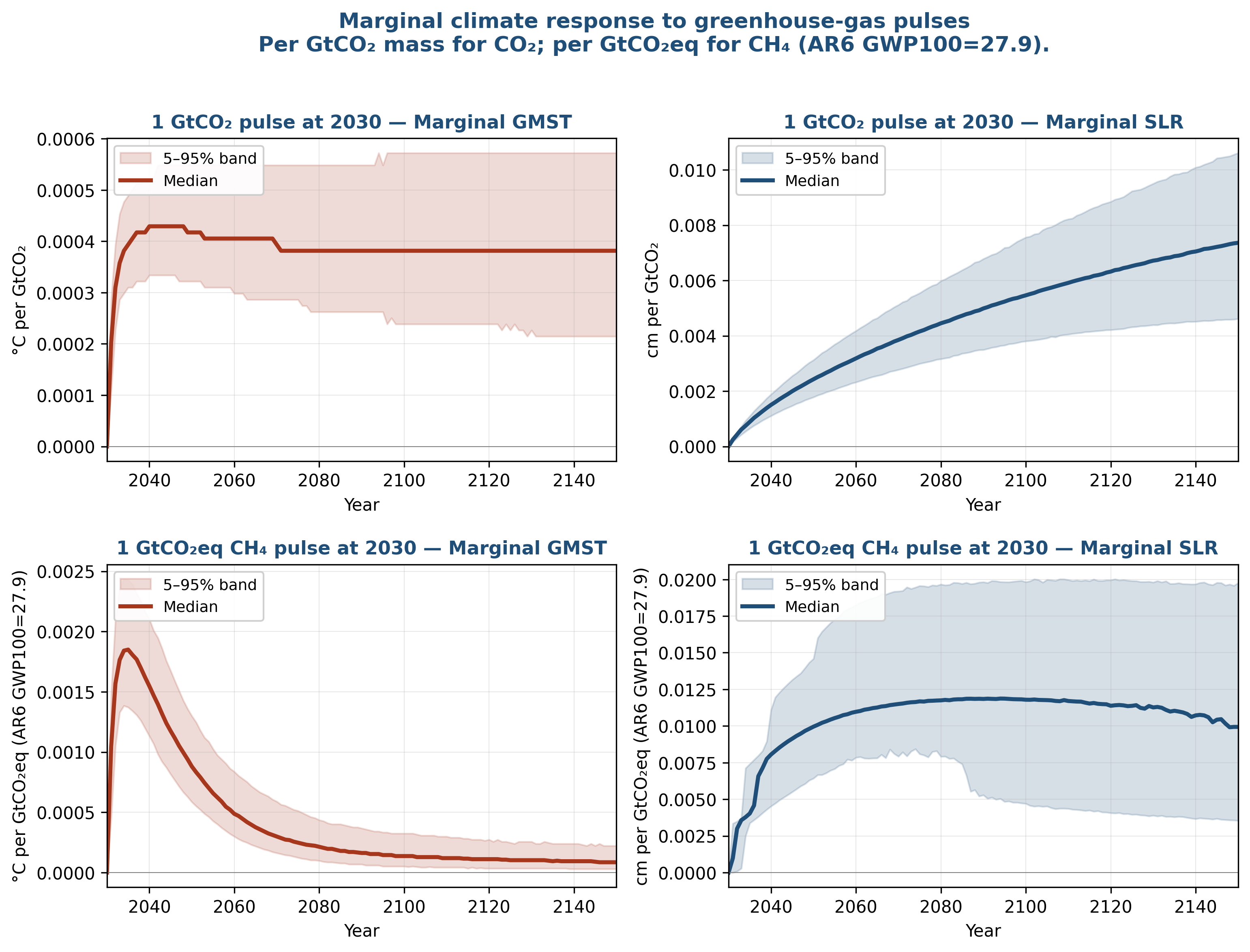
Figure 4: Marginal climate response per unit pulse emission at 2030, separated into CO2 (top row) and CH4 (bottom row). Left column: ΔGMST per pulse. Right column: ΔSLR per pulse.
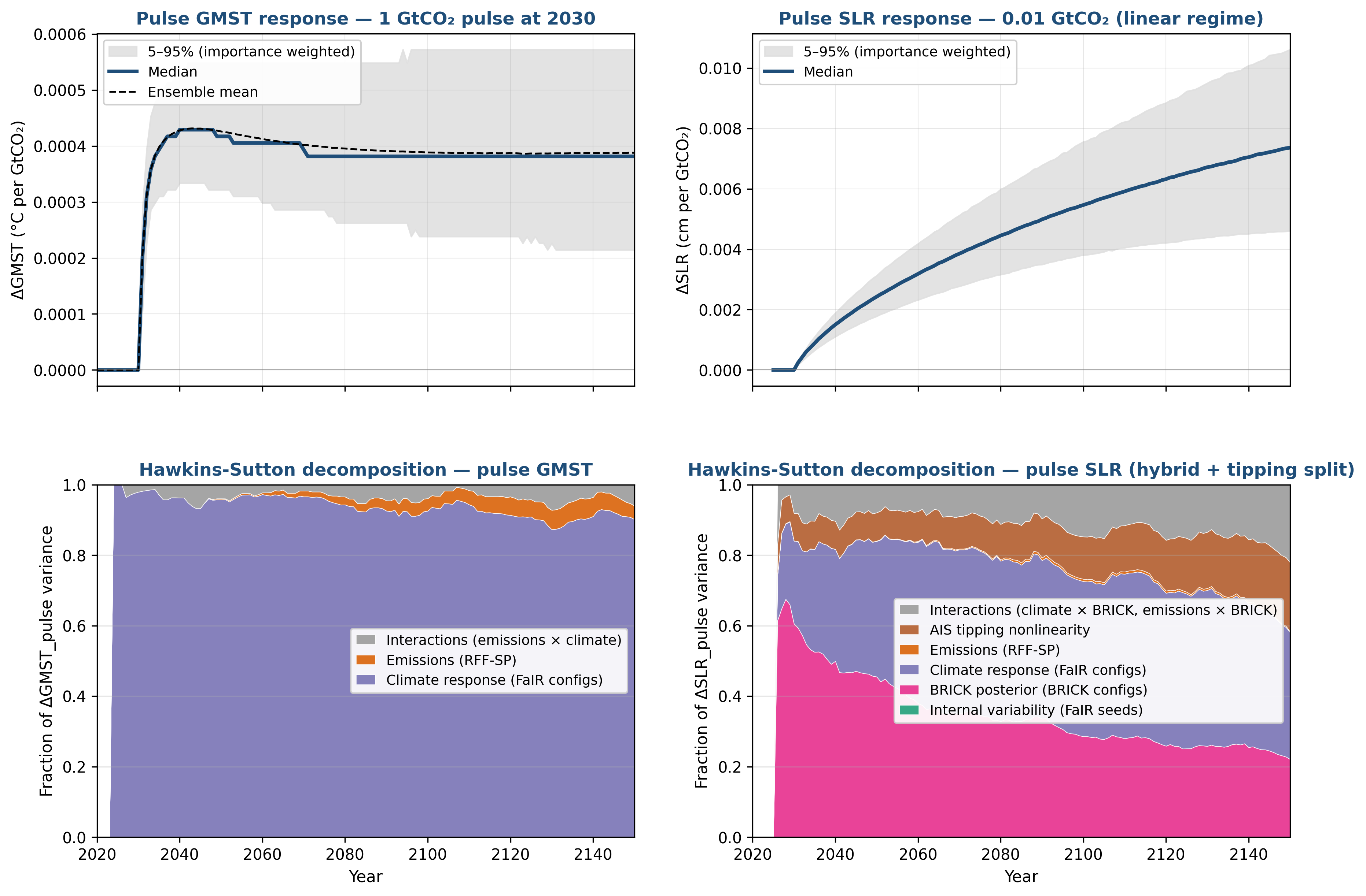
Figure 5: Hawkins-Sutton decomposition of pulse-marginal responses. Left: ΔGMST envelope and variance attribution for a +1 GtCO2 pulse at 2030. Right: ΔSLR envelope and decomposition.
My research focus at the moment is in using reduced complexity models to do probabilistic analysis to inform mitigation benefits analysis and adaptation policy planning. FaIR and BRICK are my tools of choice for this work. As such, understanding how they function and improving my skills in using them will be important to my work over the next year. Good science involves a continuous process of learning, making mistakes, and improving methodologies — that’s what “re-search” is all about.
For all the code for both this project and my upcoming sea level rise poster see my github repository. For data go to zenodo (10.5281/zenodo.20312324).
ANOVA requires a full combinatoric matrix of runs, which drastically limits how many emissions scenarios and other variables can be used. Upon reading Darnell et al. as a result of a comment on my post last week, I learned about using a Shapley machine learning approach to decomposition… but ran into some challenges where Shapley was under-attributing variance to emissions. I eventually ended up with the Sobol method, which involves training a statistical emulator on the full Latin Hypercube ensemble. Figure 3b shows that Sobol and ANOVA match reasonably well given the complexity of attributing multiple interacting components.
There may still be some issues under the hood — e.g., historical Antarctic melt may be too large and glacial melt too small, offsetting each other.
Marcus.. the most accurate “simulation” going forward is the almost perfect statistical correlation between the Earth’s global population and Mauna Loa CO2. in ppm. This was clearly demonstrated in 1987 by Newell and Marcus in a small paper with the simple title of Carbon Dioxide and People. Check it out.
Ken
Your CO2e GWP100 pulse SLR comparisons for CO2 and CH4 is novel and another demonstration of why high potency of CH4 and HFCs and other SLCPs on impacts need to be explicitly accounted for in time and not bundled as CO2e. If I'm interpreting correctly, 1 GtCO2 using GWP100 would be equivalent to about 36 MtCH4, which is about a third of the fossil methane emitted annually and about 10% of annual anthropogenic emissions. So, with 36 MtCH4 pulse in 2030 generating about 0.01 cm in 2050, 10 years of 360 MtCH4 per year would lead to about 1 cm of SLR in 2050? In comparison, 1 GtCO2 in 2030 would generate about 0.002 cm in 2050, so 10 years at 38 GtCO2 (GCB annual fossil CO2 in 2025) would be about 0.8 cm in 2050. Am I extrapolating correctly?